
Thursday, 3 November 2016
Tuesday, 1 November 2016

Monday, 31 October 2016

Wednesday, 26 October 2016
Task 9 Desktop Publishing Screenshots of Progress: Double Page Spread

- Here, I am starting to make my Double Page Spread and I am sticking to the same colour scheme (and conforming to the conventional 3 colour scheme rule) by using black and white (through gradient). I will be using the colour red for most of the text. The colour scheme I am using is inspired by Q Magazine's colour scheme as it is simplistic and they are
- This is because I want to keep my colours bold and bright but not too bright and colourful as I am targeting an audience of 16-27 year olds and I want my media product to look as simplistic as possible.
- I have used the rectangle shape tool to create rectangles as I will fill them with text (page numbers, title, strip, banner etc).


Task 9 Desktop Publishing Screenshots of Progress: Contents Page

- Here, I am starting to make my contents page and I am sticking to the same colour scheme (and conforming to the conventional 3 colour scheme rule) by using black and red and white (through gradient). The colour scheme I used is ispired by Q Magazine as they also have elements of the Pop Music genre in their magazines.
- I want to keep my colours bold and bright but not too bright and colourful as I am targeting an audience of 16-27 year olds and I want my media product to look as simplistic as possible.
- I have used the rectangle shape tool to create rectangles as I will fill them with text (sub titles, title, strip, banner etc).

- Here, I have added the title contents on the top left of the page and added the issue number and publish date. This is conventional and I took inspiration from one of Q Magazine's contents pages.
- Also, regarding the layout I have aligned the rectangles and made two columns so the layout can be structured which is conventional and is essential for me as I want to keep my magazine looking as neat and professional looking for my target audience as possible.
- Furthermore, I have added my main image and I chose to use the same model from my front cover again as she is the main attraction of this magazine and I want my audience to focus on her. Her image links to the feature article (the DPS).
- Again I took inspiration from Q Magazine contents pages and I positioned the main image on the top right hand side.

- In this screenshot, I have filled in all the rectangles with page numbers (which is conventional) and titles of all the features of this magazine to inform the audience of what kind of content my media product features and what pages they can find the content on.
- I have also wrote the name of the model as anchorage so the audience can easily decode who she is and they will be familiar with her as they have already seen her on the front cover.
- I have also added an image of one of my locations from my photography of street art/graffiti which ties in nicely with the genre of my magazine which is Pop and complements the costume of my model as she is wearing a hoody and tracksuit which is stereotypical 'street' clothing.
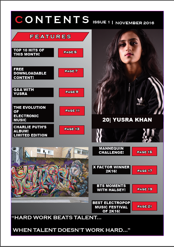
- For the final screenshot, I have changed the font of the text from Algerian and Bauhaus 93 to Coppergate gothic bold and Arial because I realised that my font needs to be big and bold in order to make it simplistic for my audience and that fancy fonts would be harder for them to decode.
- I also added a quote at the bottom that is from the interview featured in my magazine which is challenging the conventions of my magazine as normally you would put a page number, magazine title, issue date or web address. However, I decided to put a quote because I felt like teasing the interview with my celebrity would make my audience more inclined into reading further because the quote would have grabbed their attention and make them curious.
Monday, 24 October 2016
Sunday, 23 October 2016
Task 8 Photography - Camera Induction Notes and Photographs!
Photography Notes
- 3 Point Lighting
- Do not have the model right at the back/ too close to the backdrop. Roughly 4-5 feet away from the backdrop.
- Turn off lights while photograph taking.
- Transmitter - Use left button to test
- Download photos straight away
- Black = Nikon
- Grey = Canon
- Flashlights (Black Stands) Must be at 45 degrees angles
- They do not heat up (the black bits do not) making it safe to touch
- Do not touch the raw light inside
- Beep indicates that everything is ready to go.
- To turn on press the squiggly line
- Green button is used to test the light
- If the dial is on 1 then it is at the lowest brightness
- The number 6 means it is at its brightest
- Recommended to keep each light at 3
- Switch the light off to avoid getting electrocuted/serious harm.
- Soft boxes are the square things that soften the light
- If it is diffused the light will be even.
- The black stands can be closer but the tallest one (at the back not the side ones) must be left where it initially was.
- Main Key Light = Right side of the face
- Fill Light = Fills in shadow for even distribution
- Tallest light also known as the separation light or hairline light makes the hair visible and it brings the cover star forward and separates them from the backdrop.
- Camera is the Nikon D-7-100 and the lid should be kept on
- It is 18 - 105 in terms of zoom in length
- The left of the camera is where all the modes are located
- 2 modes are A and S
- A or Aperture Priority has one set of numbers
- These numbers control the DOF (Depth of Field)
- A Shallow DOF only focuses on the model and not the background
- DOF = Foreground and Background
- S or the Shutter Priority controls how fast the shutter is going
- This is useful if the models are moving
- To control the Shutter Priority use the Back Dials
- Turn it right and the higher the number
- Turn it left and the lower the number and higher the depth of field
- And faster the shutter
- To view the photos press the Play button
- WB = White Balance and it means the lights are on with natural light
- ISO = Film Speed, higher the number, use the top dial and use either 100 or 200
- It is recommended to shoot in raw so the file is raw
- To change the picture mode: Press the menu button, go to green, set picture control and then neutral to colour
- ENSURE everything is on A
- If there is no BEEP = It is too focused or too far away
- BEEP = Focused
- Move Black Stands a bit back if photo is too bleached out
- Don't go higher than 3
- Shoot in portrait mode
- Lens put in palm in hand (left)
- Big Circle = warm light = colour
- Bounces off = BW
- Look through the viewfinder and not the screen!
Here are some photos that I took during the photoshoot session.


Thursday, 20 October 2016
Using Illustrator for the First Time

Today we learnt how to use the program illustrator and the features it contains. We used the knowledge we've gained in order to help us manipulate text we typed into different styles. We also learnt how to use the clipping mask and compound feature and how to draw different shapes. I used the star and altered the way it looks like by using the anchor tool in order to give it a different shape. Furthermore, we also learnt how to use the snipping tool on windows in order to create a screenshot which is an easier way than pressing printscreen and going through the process of exporting the image file. Also, we learn how to place an image file from the internet and use it as a background.
Wednesday, 5 October 2016
Task 7 Audience Research - Evaluation of Feedback Findings
- “5 colours…it’s going to look messy”
- I took this into consideration and decided to conform to the three colour scheme convention by only using the colours: white, red and black.
- I did this because I felt like my magazine should be aimed at older teen – adult audience rather than younger kids hence why I changed the number of colours and the colours themselves.
- “Masthead…sounds like EDF”
- I agreed with this comment and changed the name of my magazine as I realised how my magazine can be confused with the latter. So I decided to rename my magazine to Eclectic as it sounds a little bit electric and the meaning of the word is broad range or diverse which defines Pop Music as a whole.
- “Age range is bit too big”
- I changed the age range of my magazine which originally was 10 – 27 and now it is 16 – 27 and I did this because I felt like an immature audience and a mature audience will not like the same things or have an interest in the same things. This is why I decided to narrow the gap between the audiences and made the target audience older as I feel like the content in my magazine would be more appealing to older teens and young adults.
Monday, 3 October 2016
Task 6: Short Proposal

21/10/2016
*UPDATE MAGAZINE PROPOSAL AS OF THE DATE ABOVE*
Magazine Proposal
The title of my publication will be: Pop Fanatics, and by the title the
reader/audience could already infer that the magazine will be centred on the
genre of Pop.
The magazine’s genre is pop and I
chose it because it is the largest genre of music with many sub-genres and it
is my most favourite.
The kind of content I will include is
an interview (with a Question and Answer structure) with a famous pop artist
like Charlie Puth for example. This links back to I will also include random advertisements
to keep the reader’s interest and attention. Furthermore, I will feature
anecdotes of musicians’ lives to give the audience an insight on how life is
like in the music industry.
The masthead will either be centred
across the page or in the top left of the page and it will be partially covered
by the dominant image/cover star in order to insinuate the cover star’s
significance. This links my magazine to the vibe magazine I analysed back for
task 2 (the case studies) because the cover star Usher is covering most of the
letter ‘b’ of the magazine’s masthead ‘Vibe’ in order to connote his
significance.
The angle for the cover star’s shot
will be taken at eye level (which is conforming to the conventions of a
magazine) with a direct gaze in order to create this feeling of intimacy
between the star and the reader/audience. Furthermore, it connotes equality as
the cover star is not looking down at the reader/audience but instead looking
at us on the same level as we are looking at him. This implies that the cover
star is not superior nor is he/she inferior but he/she is just a human being
working hard, regardless of his/her fame, power and wealth.
This links back to my case study
research (task 2) to the Magazine analysis as Liam’s (the cover star for the
magazine) shot has been taken at an eye level which connotes that although Liam
is an artist, the magazine wants to make it appear that he is on the same level
as everyone else.
The type of shot for my magazine will
be a close-up or medium close-up in order to evoke a sense of intimacy and for
a more direct mode of address.
The lettering will be simplistic
(like a sans-serif type of font) as to make it easier for the reader/audience
to decode. This links to the Vibe magazine I analysed for task 2 where the
lettering was simplistic and easy to read.
The colour scheme will challenge the
conventional 3 colour scheme rule as I will use 5 colours instead. These are:
Black, yellow, blue, red and white and this what ideally would make my magazine
different from the other conforming, conventional magazines out there. However,
these are subject to change and I may instead revert back to the conforming 3
colour scheme/use alternate colours if the use of 5 colours will make my
magazine messy and untidy. However, Top of the Pops magazine also challenges
the conventional 3 colour scheme so it is not something completely rare.
The publisher that I have decided to
use is EMAP (AKA Ascential) because they previously used to publish Q Magazine
but later sold it to Bauer Media and they now currently do not have any music
magazines that they publish. I think because my magazine conforms mostly and
challenges (a bit) the conventions of music magazines that they would most
likely accept to publishing it and the fact that they do not currently have a
music magazine means it would most likely boost their popularity and the amount
of income they make.
Sunday, 2 October 2016
Task 6 Drafting and House Styles - My Original Masthead

Today I have completed my masthead for my magazine and I am going to start doing a plan of my front cover.
Friday, 30 September 2016
Magazines That I Looked At For Research And Inspiration
These images are of magazines that I researched as a means of inspiration and they helped me with creating the house style of my magazine etc.


Task 5 Magazine Research
Case Studies
Questions
Do they offer subscriptions? Reasons
why?
Vibe magazine, Top of the Pops
magazine and Clash magazine all offer subscriptions. This is because they
receive constant revenue from their customers and it helps build a strong relationship
between the customers and the business as they are constantly giving them
content.
It also provides benefits for the
customers as it is time efficient as you do not waste time and effort going to
the shops and buying a copy. Furthermore, subscriptions may offer discounts
which makes them cost efficient.
Top of the Pops magazine’s
subscription has 12 issues a year and it costs £66.08 in total and £7.50 for a
single issue and if you divide the total cost by 12 it is £5.50 for every
issue.
Thursday, 29 September 2016
Practice Music Magazine Using Photoshop

I have learnt how to save my work as different file formats, there is still a bit need doing as I have cover lines and puffs to add and a barcode. The cover star is Halsey who is an Electropop music artist. I have learnt also how to add text and place images in photoshop.
Wednesday, 28 September 2016
Task 4: Evaluation and Feedback of PT - What Went Well - What Could Be Improved - 3 Points for Development in Main Task
College Magazine (Preliminary Task) Evaluation
Front Cover
For my front
cover, there are many things that went well and there are things that can be
improved as well. Firstly, the layout of the page; the masthead is located at
the top of the page going across from left to right. The masthead reads “LSC”
which is an abbreviation for Leyton Sixth Form College. I used the font (Arial)
for the masthead as well as for the rest of the text on the cover to keep
consistency and for simplicity. This will help the audience/reader decode the
information more easily. Part of the masthead is covered by the cover star in
order to connote the cover star’s significance and it will cause the
reader/audience to focus more on the dominant image.
A medium
close-up shot was taken at eye level for the image of the cover star which
considered conforming to the conventions of magazines. The cover star is
looking with a direct gaze which means there is a direct mode of address. The
angle was at eye level in order to connote equality and to evoke a sense of
intimacy between the cover star and the audience/reader. This is to make the
reader feel connected to the cover star and that they are both neither superior
nor inferior to one another, they are both equal (regardless of fame or
wealth).
There is a
web link in the bottom right of the cover for the website of the college which
will promote the college and increase its popularity and a date near the top
right to inform the reader of the date that the magazine was published. I also
used a barcode as well to conform the general conventions of magazines.
I conformed
to the three colour scheme convention by using blue, black and red as the
colours for my text in order to keep the cover looking professional and neat
for the reader/audience. It also helps the reader make decoding the front cover
easier. Furthermore, I used a puff with a splat shape (thanks to my knowledge
of Adobe Photoshop) which will instantly grab the reader’s attention. Lastly, I
used anchorage (by writing the name of the cover star) in order to tell the
reader who the cover star is.
When it
comes to improvements, I think that I could have organised the placement of the
cover lines and text a bit neater by putting them in two columns one on the
left side and the other on the right side. This is because the cover lines are
all over the place along with the puff which makes the cover look a bit messy.
I also could’ve put a price tag in order to inform the reader of the price of
the magazine. There is also a filter used for the image of the cover star which
isn’t normal/conventional when it comes to cover stars for music magazines in
general.
Contents Page
For the contents page, I once again conformed to the
conventional 3 colour scheme using the same colours as the cover of my magazine
in order to keep consistency and simplicity. This helps the audience/reader to
decode with a bit more ease and it reminds them that this is the same magazine due
to the similarity of the colour scheme between the cover and the contents.
Furthermore, I also used a gradient background as well. A drop cap was used as
well as it is a conventional in the contents pages of magazines.
When it comes to the layout of the contents page, I
organised the content in two columns. I used images that show the institution
(the college) and they are located on the right hand side of the contents page.
The information such as the page numbers are located on the left hand side.
This is to give a more professional and neat look to the magazine and it will
help the reader decode easily.
I used the same font
(a sans-serif font) throughout the contents page for consistency and simplicity
in capital letters to make it easier for the reader to decode. The page numbers are big, bold with a black
and red colour whilst the information about the page is in black and blue. This
is to help the reader differentiate between the two.
Tuesday, 27 September 2016


Monday, 26 September 2016


Task 3 Preliminary Task - An Analysis of an Example of a College Magazine

Cover star of a young man holding books and smiling - this connotes he is a student and he is happy and it creates a positive atmosphere
He is wearing a crucifix which connotes he is Christian and religious.
Masthead is behind the cover star/dominant image which connotes that the cover star is more significant.
barcode and puff
Sunday, 25 September 2016
Saturday, 24 September 2016
Task 2 (A) Textual Analysis of 2 Magazines (Or More)
Quick Notes and Images:


- Vibe magazine Usher
- Contents page
- Image
- Medium Long Shot
- Body language
- Mise en Scene: Clothing
- Page Layout
- One Column
- Features is a sub heading
- Features: In depth, longer articles
- Page Numbers in chronological order
- Lots of advertising
- Double page spread
- Mid Shot
- Cigar: Old school glamour
- Expensive
- 3 columns
- Using a Q and A structure
VIBE MAGAZINE COVER
Genre Evidence
- Main Image/Cover Star is Usher and this reflects the genre of the magazine as Usher is widely known as an RnB and Hip Hop music artist. The simplistic sans serif font which is easy to read and decode for the audience is also evidence for this magazine’s genre. The skyline also features names of other famous artists like John Legend and Jim Jones who are also famous names in the RnB and Hip Hop genres. The designer sunglasses and that watch that Usher is also wearing also reinforces the point that this is a hip hop and RnB magazine as it connotes global superstar quality.
- 3 colour scheme (black, blue and yellow) This is to keep the magazine clear and simple so the audience can decode with ease. Too many colours would make the cover look a bit too messy and difficult to decode.
- Low angle shot connotes dominance and the power of Usher as a global superstar who is famed around the world.
- MLS (medium long shot) has been done to show the audience precisely the details of Usher’s clothing, for example: White clean t-shirt along with dog tag reinforces star status, zip is undone to reveal it and to make Usher look more sexually attractive. The aviator designer shades and watch makes Usher connotes wealth, power, fame which also reinforces his star status.
- Mise-En-Scene: Usher styled as pilot, aeroplane in background, pilot costume, Aviator shades – link to pilot, also star status).
- The aeroplane in the background contains the text “USA” which connotes Usher’s iconic, global, American superstar status.
- (Possibly natural) High key lighting (possibly of the sun) emphasises Usher’s star quality.
Page layout, Image, language
- Mast head behind cover star.... this is to put more emphasis on the cover star and to insinuate his significance. Masthead is easily recognisable so it would not be a problem for the audience to decode that it is a vibe magazine.
- Anchorage in the main cover line which reflects the image as it is helping the audience to decode who the cover star (Usher) is.
- Sky line – other stars, key selling point as it contains
- QR code, Barcode which are essential for the magazine’s selling purposes.
- Website link (URL) to promote the magazine and company and to create growth on social media.
- Other cover lines to advertise and attract audience's attention as they contain names of other famous people like Le Bron James.
- Sans serif font so reading and decoding is easier for the audience as it is simplistic.
- Puff = “Meet the mean girls +” Language is fairly more informal e.g. “Young and Reckless”
Contents Page
Notes
- Image
- medium long shot
- Body Language (Mise-En-scene) – Clothing
- Page Layout
- 1 Column
- Features – SUB-HEADING
- Vibe logo
- This contents page is taken from the VIBE issue featuring Usher on the front cover. The masthead reads "Featured" instead of "Contents" and the various articles in the magazine are listed in a column format on one side.
- By observing the contents page, it is pretty plausible that this is the same magazine, which is extremely essential, as a lack of correlation between the front cover and the rest of the magazine can lower the standard of the magazine.
Mise En Scene, Image, Layout
- Usher is seen standing with legs apart with a confident posture. He is wearing a denim shirt and a snazzy leather coat and it is unbuttoned revealing his clean white t shirt (similar to the front cover) making him somewhat appear as sexually attractive. This connotes to the audience that he powerful and dominant and reinforces his global superstar status.
- He is also wearing the same aviator shades seen on the front cover, creating a link between the two. He is no longer wearing any pilot clothing and instead wearing casual clothing indicating to the audience he is ready to shake the music industry metaphorically.
- Usher is standing near a grey wall which matches the greyish tones of the front cover. The text is written in a colour of white, so it is clear for the audience to decode against the background. The page number is written in black, so it stands out from the white text next to it.
- This contents page is very plain aside from the text and the photo of Usher, this is something I will bear in mind when I produce my own magazine.
- Regarding the appearance of the contents page, it is quite simple and plain, not too colourful and complicated.
- There is only one column and the text is aligned on the left hand side of the contents page.
- The subheadings of each article/piece of text are in big, bold, white capital letters to help the audience decode that they explain what each article is about.
- The angle again is taken at a low angle which connotes Usher’s powerful and superstar status. The shot is again a MLS (Medium Long Shot) as it shows the fine details of Usher’s clothing which are explained above.
- The lighting is also high key again to emphasise the significance and power of Usher.
- Usher’s facial expression has a sort of tough, arrogant and confident vibe to it which reinforces his dominance.
DPS (DOUBLE PAGE SPREAD)
- This DPS of the Vibe Magazine features an interview in a Q and A structure. Usher, the RnB and Hip Hop celebrity who is easily recognisable by the audience, gets interviewed in this feature page.
- While it is not a rare convention, Usher has been given an entire page of his image and the writing on the other. This allows a better use of space and a bigger image to be displayed as well which is crucial for the audience as they would decode the image with ease.
- In the picture he is wearing a blue denim jacket and a plain white t shirt, the denim jacket is made by a company called G-star raw, this company produces urban fashionable clothing which helps to show the stereotype the artist is portraying. He also suggests he is wealthy as he is wearing an expensive looking ring and also a large watch; this is another common thing about RnB artists. Additionally, the fact that he is smoking a cigar shows that he is also wealthy.
- Concerning the image, it is taken at a low angle with high key lighting on Usher’s face which connotes his power and dominance. There is an indirect gaze/mode of address as Usher is looking away at something else, which suggests to the audience that he is either too significant for the camera or he is more interested with whatever is in the corner.
- A pull quote is used and is located in the top right corner of the page and it is an extract from the text of the DPS. It states “Michael Jackson was the greatest entertainer that ever lived, I just want to be the greatest entertainer living.” Here, the word greatest is highlighted to emphasise the significance of the word and significance it has to Usher.
- It is also stereotypical of Usher to say it because a lot of RnB artists share a similar attitude and it also ties in with his look.
- The pull quote is also in big, bold white text to make it stand out and it enables the audience to decode it with ease.
- Regarding Usher’s apparel, he is wearing a blue, denim jacket which is unbuttoned near the top to reveal the same white clean shirt that Usher is seen wearing in the front cover and the contents page. This is to make him look more sexually attractive towards the audience.
- The denim shirt is made by a company called G-Star Raw, which produces urban fashionable clothing which helps to show the stereotype that the artist is portraying and it also reflects the hip hop and RnB genre. It is expected from an artist of Usher’s calibre.
- Usher is also seen wearing a wristwatch that appears to be a tailored made piece that is of great value and is smoking a very thick cigar which are clear connotations of power and wealth.
- The questions on the other page are in bold, with the answers in normal, standard font. Usher uses slang words and expletives, indicating that this is an informal interview. This helps the audience decode that Usher is an RnB artist as he talks like them. Genre specific names of other artists have been also included which would appeal to Vibe’s key demographic.
- The target audience would be males and females aged 16-25, these are people who would listen to RnB songs. Also, females would like to know more about male artists, so Usher’s interview would give them more insight into who he is as a person.

Clash magazine
- 2 pages
- Some editorials listed
- 29 sections
- These include, shopping, news, blog, top 10 etc.
- They are in chronological order.
- 6 columns 3 per page
- They are aligned straight one below the other
- There are brief descriptions of each section
- Mixture of high key and low key images
- Mixtures of medium long, long shot, close ups,
- Mixture of eye level and low level angles
- Mise En scene Studio equipment
- Connotations = Hippie, vintage, emo.
DPS
- It is about the artists Allison and Jamie.
- Q and A structure
- Mostly first and second person, a bit of third person as well.
- A bit more of a formal tone, possibly due to the magazine being aimed at an older, mature and posher audience.
- The font is quite unique and not simplistic, a bit vintage which reinforces my point that this magazine is aimed at an older audience.
- Pull quote uses the word ‘idiosyncrasies’ which is quite a complex word which again reinforces the fact the magazine is not aimed at an audience of teens perhaps older adults.
Q MAGAZINE COVER
- The cover star is covering part of the masthead and text in order to connote Liam’s significance and importance.
- Also, there are cover lines to the right hand side of the magazine which feature names of famous musicians such as Sam Smith and Sinead O’Connor. This further reinforces the point that this magazine is a music magazine that features pop and rock.
- Furthermore, the magazine uses a simplistic sans serif font which is big and bold which helps the reader and audience to be able to easily decode that is a Q magazine.
- The masthead is the signature Q which is what makes the Q magazine and company easily recognisable. It is big and bold and it stands out due to the red and white colours being contrasting colours.
- The 3 colour scheme is red, black and white. This is to keep a simplistic and clear look to the magazine so that the audience has no difficulty decoding this front cover. Too many colours would be too visually intrusive and complicated for the audience of this magazine to decode.
- The angle that this image has been taken is at an eye level angle. This is to create a sense of mutuality between the audience/reader and the cover star.
- This connotes that there is equality between the two of them and neither are superior or inferior to the other regardless of their fame, power and wealth.
- Even though Liam is a famous artist, the magazine wants to make it appear that he is on the same level as everyone else.
- MCS (Medium Close Shot) has been done to further reinforce this idea of mutuality and equality between the cover star and reader. Also, a direct mode of address as a direct gaze is used and Liam’s hair style further connotes a typical rock star’s look which suggests to the reader that he is a rock music artist. Liam is also wearing a snazzy whitish coat and that paired with his hair style further connotes his power, fame, rock star style.
- Due to the image being in black and white, it is difficult to tell if it is high key lighting or low key. However, as the details of the face and coat are shown, I would go with high key.
- Anchorage has been done through the main cover line which fixes/reflects the image as it is helping the audience to decode who the cover star (Liam Gallagher) is.
- The main cover line reads “OASIS Liam: “I went home with a shotgun…” is big and bold (The Oasis part) with the second half in red text with a sans font as opposed to the rest of the text which are in a sans serif font. This is to help make it stand out to the audience so that it connotes significance.
- That main cover line also uses a pull quote in order to attract the target audience as it introduces that there is going to be an interview with Liam Gallagher from Oasis. By using the word “SHOTGUN” the reader will be more inclined to read what is in the magazine. The word OASIS is also drop capped in order to connote its significance and to help the audience decode it easily.
- The barcode is located at the bottom of the front cover so that the date/issue and price can easily be located to check when the issue was released.
- The “37 pages of reviews” sell line shows the target audience what the magazine essentially contains. The number “37” is drop capped to emphasise the quantity of pages and connotes the vast number of reviews.
- The puff/flash engages the target audience to read. It states “TWO COVERS TO COLLECT, 20 PAGE SUPERNOVA” and this stands out on the page due to the blue, white and black circle contrasting with the red and white.
- CONTENTS PAGE
- This contents page is taken from the Q Magazine issue featuring many famed artists in the pop, rock genre. The masthead reads contents and features the Q logo and the date of the magazine and the various articles in the magazine are listed in a column format on one side.
- By observing the contents page, it is pretty plausible that this is the same magazine, which is extremely essential, as a lack of correlation between the front cover and the rest of the magazine can lower the standard of the magazine. The signature red coloured logo and the predominantly white and black colour scheme.
- Flush Left: This column is used to align all the images on this contents page and it is used effectively as it does not make the contents page look messy or weird, instead it gives a professional feel to it and is very enticing to look at due to its neatness.
- Flush Right: Just like the left column it shares its professional feel and enticing look, although it is quite smaller and there is a bit more information surrounding the images.
- Negative Space: While it is called negative space, it actually has the diametric opposite effect I think, due to it fitting in with the house style of the magazine. The whole magazine has lots of negative space and I think it fits in really well with the colour scheme.
- Kicker: The font is bigger and bolder with the name of every act on the contents page. I think this has been done purposely to make it stand out to the reader and the various acts on the contents page will attract a wider audience due to the diversity between the acts.
- The images shown on the contents page feature famed artists like Sam Smith, Jenny Lewis, Motley Crue. All these famed people featured help the reader decode further that this is a Q Magazine.
- The angles taken for the different images are either low or eye level to connote equality, mutuality, power and dominance.
- The lighting mostly is high key like Sam Smith’s one to emphasise his star quality status.
- Most are direct gazes and direct modes of addresses in order to create a connection between the reader and the artists.
- Jenny Lewis’s image uses a long shot, in order to show the reader, the details of her entire body. She is wearing white, tight shorts which could connote innocence etc. Her pose is quite promiscuous and her legs are revealed to perhaps make her look sexually attractive. She is wearing sunglasses and that connote her superstar, powerful status she holds. The background shows that she is in the woods standing on green grass.
- Sam Smith’s image features him looking down at the camera. Here, the low angle is used and he is positioned way above to connote his power and dominance. Sam is wearing a fancy suit which further connotes his superstar status and wealth.
- The contents page is quite simplistic, in the sense that there is not too much information/writing and the only times multiple colours are used are just for the circles containing the page numbers. But in actuality, the colour scheme of the page is black and white predominantly.
- The subheadings of each page/piece of text are in big, bold, black capital letters in a sans serif font that reads the names of the famous people who are featured on each page. This will help the audience decode what the pages are about more easily.
- Demographic: The demographic of this magazine is most likely to be late teens to an older age because some of the bands are quite old and they may not appeal to a younger variety. The magazine is also aimed at both genders as both genders enjoy the rock genre.


Friday, 23 September 2016
Genre of Music I am Working On
The genre of music that I have chosen specifically to work on is pop music (which is the most consumed music of today) as it is my most favourite genre of music for various reasons. This is because pop normally has a catchy and upbeat feel to it, which personally suits me a lot. It is also the fact that we consumers are so exposed to it
Several studies have shown that the parts of brain responsible for emotions and especially our brain’s reward centers respond more actively to a piece of the music that it’s already acquainted with than to an yet unfamiliar song, even if the latter fits the person’s musical taste far better.
Really, this is no surprise. Humans love repetition. We feel more safe and comfortable interacting with something we are already familiar with; such experience is more compelling and enjoyable for the majority. Repetition invites the listener into the music as active participant – It doesn’t take long until one’s tapping the feet following the rhythm of the song.
Repetition factor plays an important role in two ways: First, repetition is a characteristic trait for a music in general, but more so in case of pop music. Additionally to that pop music is the one genre that we are most exposed to. We assumed that we hear a song everywhere because it’s popular when actually it’s exactly the other way around: a song is popular because it’s played everywhere.


Thursday, 22 September 2016
Introduction
Introduction
My name is Mohamed Jabir Zaman and I am 16 years old and I'm currently doing AS media studies, English Literature and Computer Science. I had previously done a GCSE in media studies and got a grade B fortunately. Hopefully, I will be able to implement all the skills I had learnt and incorporate them into A Level media. I will be posting on this blog my progress throughout the two years I will spend in Media Studies as a way to be able to view the development of my skills.
Tuesday, 20 September 2016

Subscribe to:
Comments (Atom)