Task 9 Desktop Publishing Screenshots of Progress: Contents Page
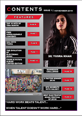
- Here, I am starting to make my contents page and I am sticking to the same colour scheme (and conforming to the conventional 3 colour scheme rule) by using black and red and white (through gradient). The colour scheme I used is ispired by Q Magazine as they also have elements of the Pop Music genre in their magazines.
- I want to keep my colours bold and bright but not too bright and colourful as I am targeting an audience of 16-27 year olds and I want my media product to look as simplistic as possible.
- I have used the rectangle shape tool to create rectangles as I will fill them with text (sub titles, title, strip, banner etc).

- Here, I have added the title contents on the top left of the page and added the issue number and publish date. This is conventional and I took inspiration from one of Q Magazine's contents pages.
- Also, regarding the layout I have aligned the rectangles and made two columns so the layout can be structured which is conventional and is essential for me as I want to keep my magazine looking as neat and professional looking for my target audience as possible.
- Furthermore, I have added my main image and I chose to use the same model from my front cover again as she is the main attraction of this magazine and I want my audience to focus on her. Her image links to the feature article (the DPS).
- Again I took inspiration from Q Magazine contents pages and I positioned the main image on the top right hand side.

- In this screenshot, I have filled in all the rectangles with page numbers (which is conventional) and titles of all the features of this magazine to inform the audience of what kind of content my media product features and what pages they can find the content on.
- I have also wrote the name of the model as anchorage so the audience can easily decode who she is and they will be familiar with her as they have already seen her on the front cover.
- I have also added an image of one of my locations from my photography of street art/graffiti which ties in nicely with the genre of my magazine which is Pop and complements the costume of my model as she is wearing a hoody and tracksuit which is stereotypical 'street' clothing.
- For the final screenshot, I have changed the font of the text from Algerian and Bauhaus 93 to Coppergate gothic bold and Arial because I realised that my font needs to be big and bold in order to make it simplistic for my audience and that fancy fonts would be harder for them to decode.
- I also added a quote at the bottom that is from the interview featured in my magazine which is challenging the conventions of my magazine as normally you would put a page number, magazine title, issue date or web address. However, I decided to put a quote because I felt like teasing the interview with my celebrity would make my audience more inclined into reading further because the quote would have grabbed their attention and make them curious.


No comments:
Post a Comment