
Monday, 31 October 2016
Wednesday, 26 October 2016
Task 9 Desktop Publishing Screenshots of Progress: Double Page Spread

- Here, I am starting to make my Double Page Spread and I am sticking to the same colour scheme (and conforming to the conventional 3 colour scheme rule) by using black and white (through gradient). I will be using the colour red for most of the text. The colour scheme I am using is inspired by Q Magazine's colour scheme as it is simplistic and they are
- This is because I want to keep my colours bold and bright but not too bright and colourful as I am targeting an audience of 16-27 year olds and I want my media product to look as simplistic as possible.
- I have used the rectangle shape tool to create rectangles as I will fill them with text (page numbers, title, strip, banner etc).


Task 9 Desktop Publishing Screenshots of Progress: Contents Page

- Here, I am starting to make my contents page and I am sticking to the same colour scheme (and conforming to the conventional 3 colour scheme rule) by using black and red and white (through gradient). The colour scheme I used is ispired by Q Magazine as they also have elements of the Pop Music genre in their magazines.
- I want to keep my colours bold and bright but not too bright and colourful as I am targeting an audience of 16-27 year olds and I want my media product to look as simplistic as possible.
- I have used the rectangle shape tool to create rectangles as I will fill them with text (sub titles, title, strip, banner etc).

- Here, I have added the title contents on the top left of the page and added the issue number and publish date. This is conventional and I took inspiration from one of Q Magazine's contents pages.
- Also, regarding the layout I have aligned the rectangles and made two columns so the layout can be structured which is conventional and is essential for me as I want to keep my magazine looking as neat and professional looking for my target audience as possible.
- Furthermore, I have added my main image and I chose to use the same model from my front cover again as she is the main attraction of this magazine and I want my audience to focus on her. Her image links to the feature article (the DPS).
- Again I took inspiration from Q Magazine contents pages and I positioned the main image on the top right hand side.

- In this screenshot, I have filled in all the rectangles with page numbers (which is conventional) and titles of all the features of this magazine to inform the audience of what kind of content my media product features and what pages they can find the content on.
- I have also wrote the name of the model as anchorage so the audience can easily decode who she is and they will be familiar with her as they have already seen her on the front cover.
- I have also added an image of one of my locations from my photography of street art/graffiti which ties in nicely with the genre of my magazine which is Pop and complements the costume of my model as she is wearing a hoody and tracksuit which is stereotypical 'street' clothing.
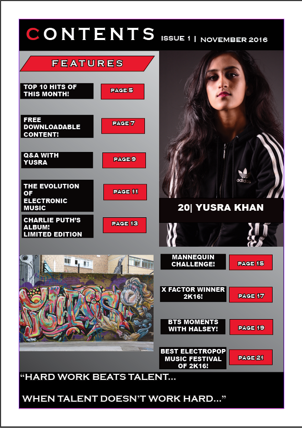
- For the final screenshot, I have changed the font of the text from Algerian and Bauhaus 93 to Coppergate gothic bold and Arial because I realised that my font needs to be big and bold in order to make it simplistic for my audience and that fancy fonts would be harder for them to decode.
- I also added a quote at the bottom that is from the interview featured in my magazine which is challenging the conventions of my magazine as normally you would put a page number, magazine title, issue date or web address. However, I decided to put a quote because I felt like teasing the interview with my celebrity would make my audience more inclined into reading further because the quote would have grabbed their attention and make them curious.
Monday, 24 October 2016
Sunday, 23 October 2016
Task 8 Photography - Camera Induction Notes and Photographs!
Photography Notes
- 3 Point Lighting
- Do not have the model right at the back/ too close to the backdrop. Roughly 4-5 feet away from the backdrop.
- Turn off lights while photograph taking.
- Transmitter - Use left button to test
- Download photos straight away
- Black = Nikon
- Grey = Canon
- Flashlights (Black Stands) Must be at 45 degrees angles
- They do not heat up (the black bits do not) making it safe to touch
- Do not touch the raw light inside
- Beep indicates that everything is ready to go.
- To turn on press the squiggly line
- Green button is used to test the light
- If the dial is on 1 then it is at the lowest brightness
- The number 6 means it is at its brightest
- Recommended to keep each light at 3
- Switch the light off to avoid getting electrocuted/serious harm.
- Soft boxes are the square things that soften the light
- If it is diffused the light will be even.
- The black stands can be closer but the tallest one (at the back not the side ones) must be left where it initially was.
- Main Key Light = Right side of the face
- Fill Light = Fills in shadow for even distribution
- Tallest light also known as the separation light or hairline light makes the hair visible and it brings the cover star forward and separates them from the backdrop.
- Camera is the Nikon D-7-100 and the lid should be kept on
- It is 18 - 105 in terms of zoom in length
- The left of the camera is where all the modes are located
- 2 modes are A and S
- A or Aperture Priority has one set of numbers
- These numbers control the DOF (Depth of Field)
- A Shallow DOF only focuses on the model and not the background
- DOF = Foreground and Background
- S or the Shutter Priority controls how fast the shutter is going
- This is useful if the models are moving
- To control the Shutter Priority use the Back Dials
- Turn it right and the higher the number
- Turn it left and the lower the number and higher the depth of field
- And faster the shutter
- To view the photos press the Play button
- WB = White Balance and it means the lights are on with natural light
- ISO = Film Speed, higher the number, use the top dial and use either 100 or 200
- It is recommended to shoot in raw so the file is raw
- To change the picture mode: Press the menu button, go to green, set picture control and then neutral to colour
- ENSURE everything is on A
- If there is no BEEP = It is too focused or too far away
- BEEP = Focused
- Move Black Stands a bit back if photo is too bleached out
- Don't go higher than 3
- Shoot in portrait mode
- Lens put in palm in hand (left)
- Big Circle = warm light = colour
- Bounces off = BW
- Look through the viewfinder and not the screen!
Here are some photos that I took during the photoshoot session.


Thursday, 20 October 2016
Using Illustrator for the First Time

Today we learnt how to use the program illustrator and the features it contains. We used the knowledge we've gained in order to help us manipulate text we typed into different styles. We also learnt how to use the clipping mask and compound feature and how to draw different shapes. I used the star and altered the way it looks like by using the anchor tool in order to give it a different shape. Furthermore, we also learnt how to use the snipping tool on windows in order to create a screenshot which is an easier way than pressing printscreen and going through the process of exporting the image file. Also, we learn how to place an image file from the internet and use it as a background.
Wednesday, 5 October 2016
Task 7 Audience Research - Evaluation of Feedback Findings
- “5 colours…it’s going to look messy”
- I took this into consideration and decided to conform to the three colour scheme convention by only using the colours: white, red and black.
- I did this because I felt like my magazine should be aimed at older teen – adult audience rather than younger kids hence why I changed the number of colours and the colours themselves.
- “Masthead…sounds like EDF”
- I agreed with this comment and changed the name of my magazine as I realised how my magazine can be confused with the latter. So I decided to rename my magazine to Eclectic as it sounds a little bit electric and the meaning of the word is broad range or diverse which defines Pop Music as a whole.
- “Age range is bit too big”
- I changed the age range of my magazine which originally was 10 – 27 and now it is 16 – 27 and I did this because I felt like an immature audience and a mature audience will not like the same things or have an interest in the same things. This is why I decided to narrow the gap between the audiences and made the target audience older as I feel like the content in my magazine would be more appealing to older teens and young adults.
Monday, 3 October 2016
Task 6: Short Proposal

21/10/2016
*UPDATE MAGAZINE PROPOSAL AS OF THE DATE ABOVE*
Magazine Proposal
The title of my publication will be: Pop Fanatics, and by the title the
reader/audience could already infer that the magazine will be centred on the
genre of Pop.
The magazine’s genre is pop and I
chose it because it is the largest genre of music with many sub-genres and it
is my most favourite.
The kind of content I will include is
an interview (with a Question and Answer structure) with a famous pop artist
like Charlie Puth for example. This links back to I will also include random advertisements
to keep the reader’s interest and attention. Furthermore, I will feature
anecdotes of musicians’ lives to give the audience an insight on how life is
like in the music industry.
The masthead will either be centred
across the page or in the top left of the page and it will be partially covered
by the dominant image/cover star in order to insinuate the cover star’s
significance. This links my magazine to the vibe magazine I analysed back for
task 2 (the case studies) because the cover star Usher is covering most of the
letter ‘b’ of the magazine’s masthead ‘Vibe’ in order to connote his
significance.
The angle for the cover star’s shot
will be taken at eye level (which is conforming to the conventions of a
magazine) with a direct gaze in order to create this feeling of intimacy
between the star and the reader/audience. Furthermore, it connotes equality as
the cover star is not looking down at the reader/audience but instead looking
at us on the same level as we are looking at him. This implies that the cover
star is not superior nor is he/she inferior but he/she is just a human being
working hard, regardless of his/her fame, power and wealth.
This links back to my case study
research (task 2) to the Magazine analysis as Liam’s (the cover star for the
magazine) shot has been taken at an eye level which connotes that although Liam
is an artist, the magazine wants to make it appear that he is on the same level
as everyone else.
The type of shot for my magazine will
be a close-up or medium close-up in order to evoke a sense of intimacy and for
a more direct mode of address.
The lettering will be simplistic
(like a sans-serif type of font) as to make it easier for the reader/audience
to decode. This links to the Vibe magazine I analysed for task 2 where the
lettering was simplistic and easy to read.
The colour scheme will challenge the
conventional 3 colour scheme rule as I will use 5 colours instead. These are:
Black, yellow, blue, red and white and this what ideally would make my magazine
different from the other conforming, conventional magazines out there. However,
these are subject to change and I may instead revert back to the conforming 3
colour scheme/use alternate colours if the use of 5 colours will make my
magazine messy and untidy. However, Top of the Pops magazine also challenges
the conventional 3 colour scheme so it is not something completely rare.
The publisher that I have decided to
use is EMAP (AKA Ascential) because they previously used to publish Q Magazine
but later sold it to Bauer Media and they now currently do not have any music
magazines that they publish. I think because my magazine conforms mostly and
challenges (a bit) the conventions of music magazines that they would most
likely accept to publishing it and the fact that they do not currently have a
music magazine means it would most likely boost their popularity and the amount
of income they make.
Sunday, 2 October 2016
Task 6 Drafting and House Styles - My Original Masthead

Today I have completed my masthead for my magazine and I am going to start doing a plan of my front cover.
Subscribe to:
Comments (Atom)